When building a data visualisation library from scratch you will often run into the challenge of mapping continuous datasets onto discrete pixels.
For bar charts this means rendering bars that sit between pixels, or have widths like 2.3px, without introducing fuzziness or unpleasant visual effects.
There are two approaches:
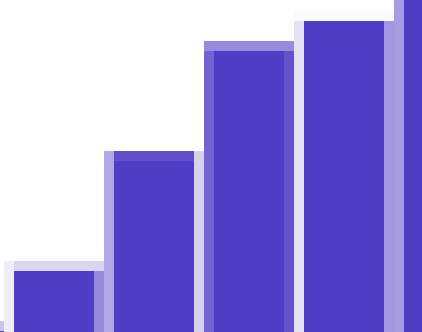
1) You can position your bars along a continuous scale and allow aliasing when a bar sits between two pixels. That’s what Dune analytics does and that’s why their bars can look a bit blurry at the edges, albeit accurate:
2) Or, you can round bar positions to the nearest pixel and prevent aliasing.
If you round your bar positions to the nearest pixel they will render crisp but now you have to decide between uneven gaps or uneven bar widths (you have to approx the continuous scale somehow).
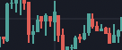
TradingView uses rounded bar positions and they use uneven gaps at smaller levels:

Sometimes they use no gaps at all:
You could use uneven widths instead to get more bar:

A downside of uneven bar widths is that it can produce a strange visual effect when the bars are really small and packed due to the repeated patterns of odd/even spacing:
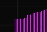
With wider bars the effect is reduced:

So stick to wider bars or use the equal bar widths strategy which is easier on the eyes at smaller widths.
note: modern displays can render half steps between pixels so round to the nearest 1/devicePixelRatio to make the most of the available space.